Roche Modular System Redesign
About
Project overview
Roche needed to transform their existing App marketplace — a complex, inconsistent ecosystem — into a scalable, maintainable, and user-friendly platform.
As the Product Designer on this project, I led the UX redesign and the creation of a modular design system that supported both flexibility and visual consistency across platforms.
The Challenge
The main challenge was to build a flexible, component-based modular framework that required balancing consistency, flexibility, and accessibility to ensure both a seamless user experience and efficient development processes.
Ensure visual consistency across multiple digital platforms.
Facilitate frequent updates through a modular, component-based approach.
Embed accessibility by design
This redesign was an opportunity to bring structure, scale, and clarity — while improving cross-functional collaboration.

Scope & Deliverables
The scope of this project included transforming the existing UI layouts into a robust, reusable design system that would streamline page creation and support ongoing content management needs.
Style Guide: A detailed guide covering typography, color palette, spacing rules, etc. providing a visual language framework for the platform.
Component Library in Figma: A fully componentized design library with multiple variants for each element, optimized for scalability and consistency across different page types.
Content Guide for CMS Use: A comprehensive content guide, offering instructions on component usage, responsive design best practices, and layout recommendations.
Documentation for Developers: Technical documentation outlining component specifications, etc.

Strategy & Design Approach
We used a modular-first approach to redesign the marketplace — treating every part of the experience as a reusable building block.
I led the creation of a modular page structure and reusable components. This included layout blocks, media modules, CTA patterns, etc. — all built to adapt to different content needs.
Key decisions
Defined content architecture that could adapt across product categories
Created page templates that balanced flexibility and brand coherence
Prioritized accessibility as a core foundation (WCAG 2.1)
Design System Principles
Modular → Built as reusable layout blocks, templates, pages
Flexible → Adapted for various product types and page goals
Accessible → Screen-reader support, keyboard nav, etc.
Scalable → Used across different page types and being scaled


Design For Accessibility
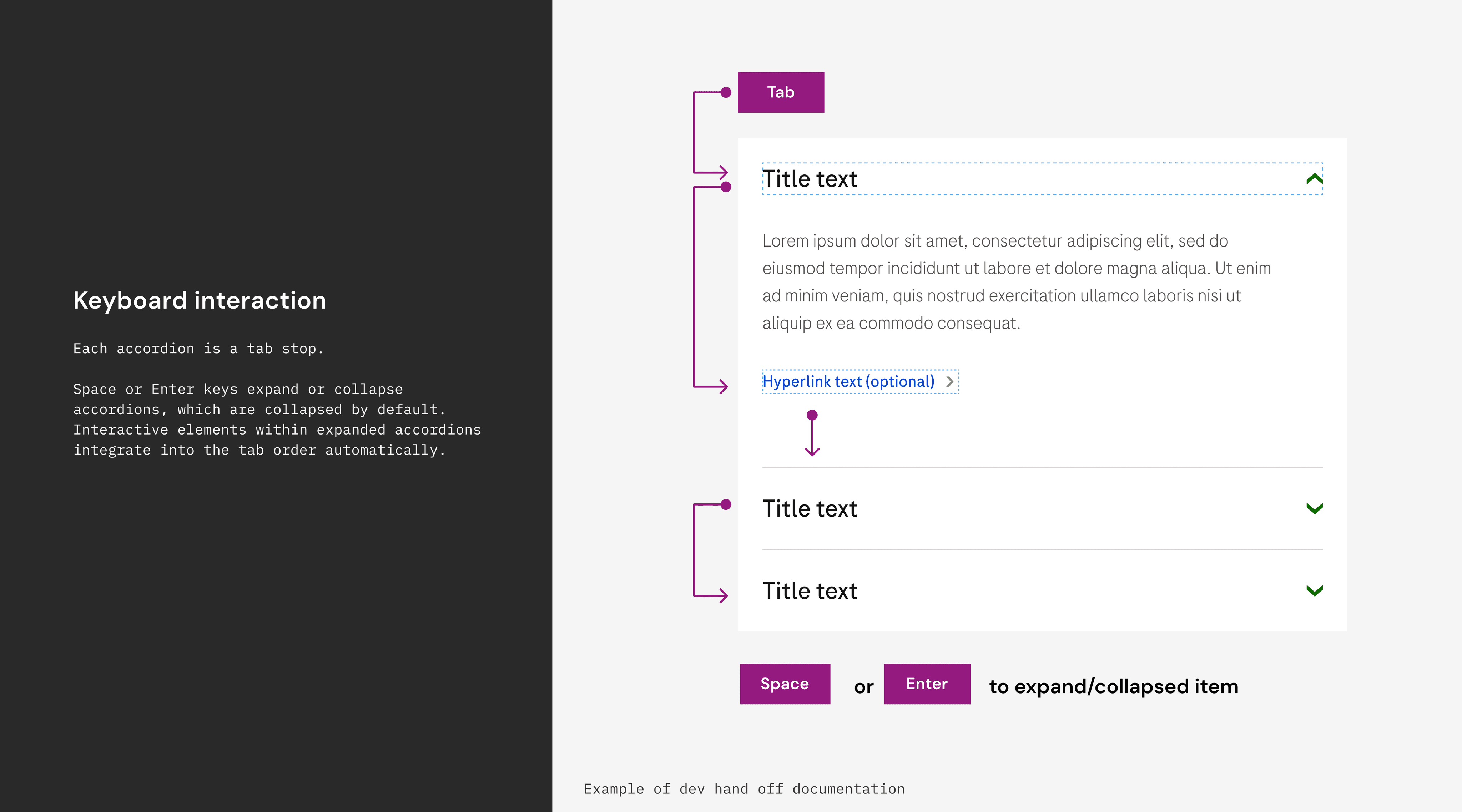
Design documentation for the development team was a key part of ensuring a smooth transition from design to implementation.
It was not only a matter of creating a specification document to capture how the modules need to be built - but it was a detailed document that outlines how to implement accessibility features in each component
Guide for Content Creators
Alongside the style guide, we created a content guide detailing how each component should be used in the context of the platform’s UX. This included instructions on how to maintain consistency, apply responsive design practices, and use specific UI patterns for user engagement.

Results and Impact
The result was a modular design framework that streamlined workflows, maintained brand coherence, and supported diverse content needs within the platform.
We successfully brought modularity to UI design, creating a system that is not only flexible, scalable, and cost-effective but also customizable, reusable, and consistent. By incorporating modular design principles and style guides, we enabled a seamless connection between design and implementation.
+150
Templates and modular components prepared
+20
Different page layouts handed off
60%
Reduced update time for new product pages
Takeaways
Modularity isn’t just a technical challenge — it’s also an editorial and UX challenge
Embedding accessibility early in design decisions avoids friction later
Strategic alignment with compliance/legal early on saved weeks during rollout
Visual consistency improves trust, but needs to be balanced with content flexibility